For six years, every single Dapper Notes notebook was wrapped in a belly band and then placed inside a clear plastic sleeve, with a little thank you note inside. The process for packaging each edition took a long time, and as a one-person business I'm always looking for ways to speed some things up. More importantly, as a brand I feel a responsibility to reduce the plastic waste that I'm sending your way.
I've been on the lookout for pre-made solutions for several years now, but all I could find was a PVA-based plastic that claims to be recyclable but in reality can only be processed through one of handful commercial plants in the world. In other words, that material is mostly a marketing scheme and not actually a more sustainable product.
Prompted by conversations with Nim during the making of Saturnian Dawn, and a Bookhead Club subscriber while working on Abbott Road, I realized it was time to take matters into my own hands and design some custom sustainable packaging for Dapper Notes.
Designing new packaging
The timing of my decision to make new packaging coincided pretty nicely with the branding process for Dapper Notes. I'd just completed putting together all of the new visual elements in a style guide of sorts, so I felt primed and ready to figure out what the packaging would look like.
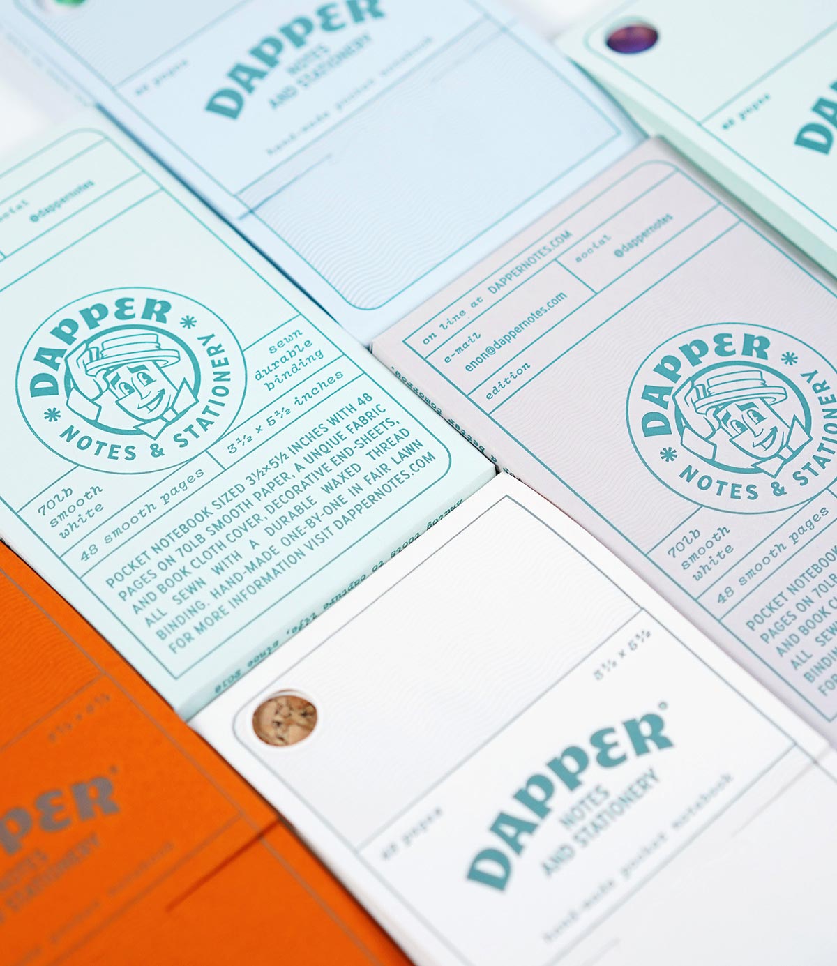
Designing packaging always starts with the physical design: What shape will it take? How will it open and close? I considered all these questions as I went through several rounds of prototyping, some of which you can see in the photo below.
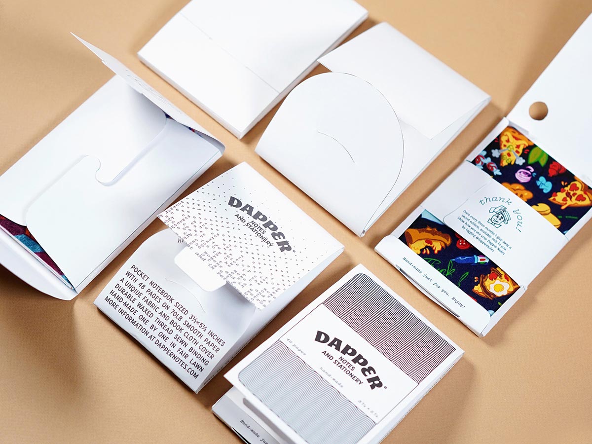
The final prototype seen below is both functional and beautiful. It brings together all of the design elements from the new branding, and echoes the first six years of Dapper Notes packaging.
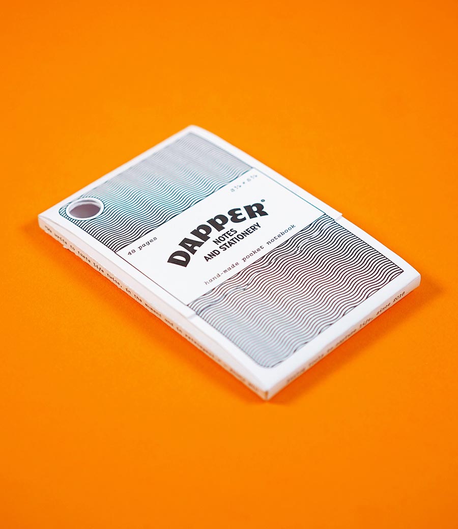
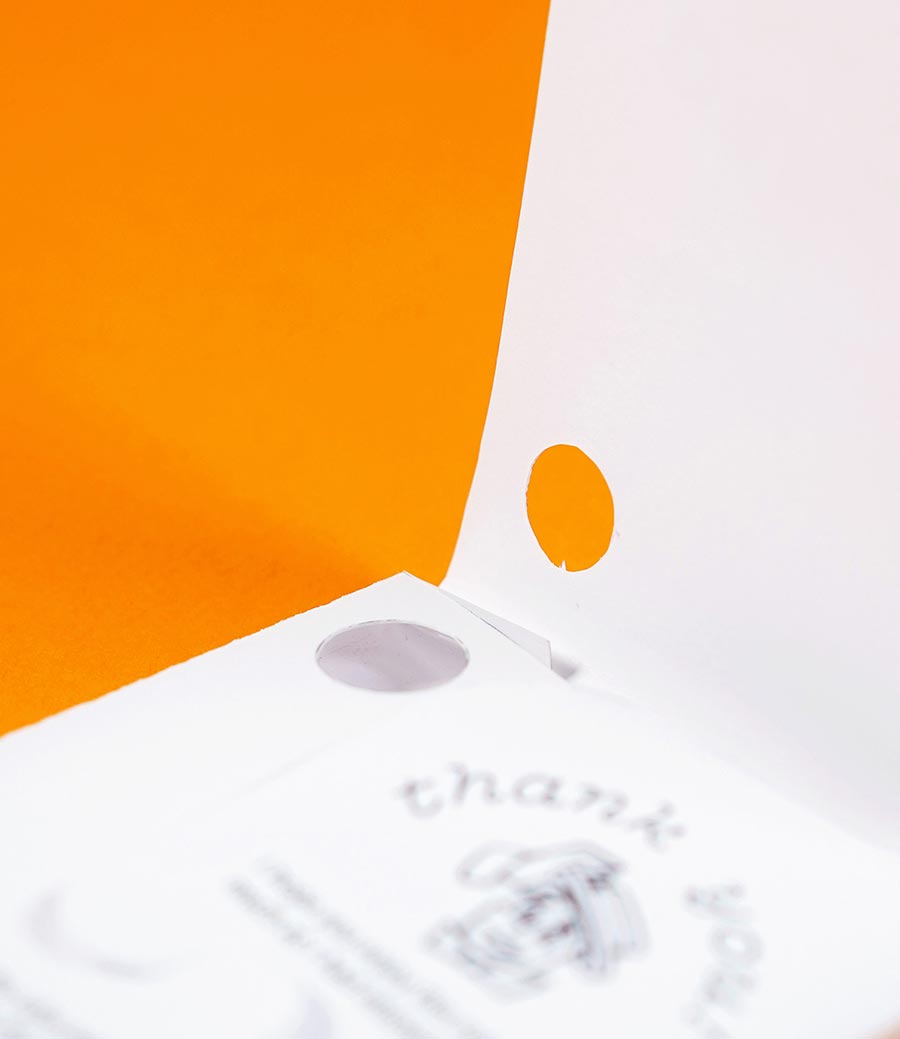
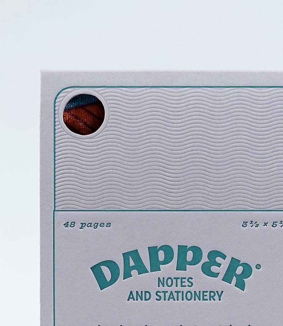
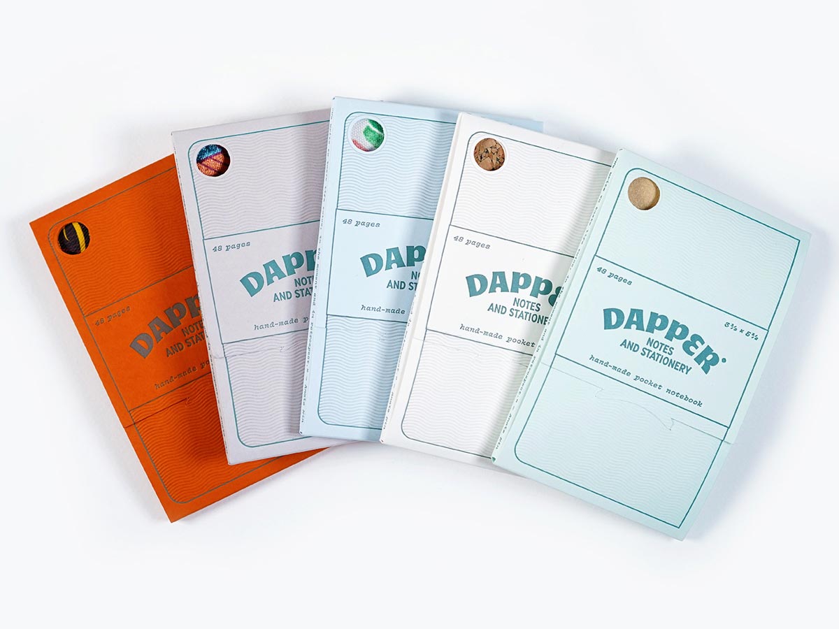
The front design features a notebook presented in RTL with a belly band much like the ones that adorned every notebook until now. And that little hole you see? It's a neat way to peek into the packaging, so you can tell at a glance which edition is stored inside.
Heading to print at Mama's Sauce
Once the design was complete, it was time to get the new packaging printed. Unlike their plastic sleeve counterpart, the new design would need to be printed on special paper, cut to the right shape, and scored with lines that would allow me to fold them into their final shape.
I've known Mama's Sauce's work for years now, and have seen many of my designer friends use them to create beautiful work. Mama's Sauce is a print shop headquartered in Florida whose attention to detail is outstanding. They specialize in a variety of printing methods, including letterpress printing, which was the way I knew I'd want to have the new packaging printed.
The service at Mama's was top notch, and together we ended up picking five different colors from Mowhawk's Keaykolour line, which were printed in two passes: one inked with Dapper Notes green, and the other with no ink.
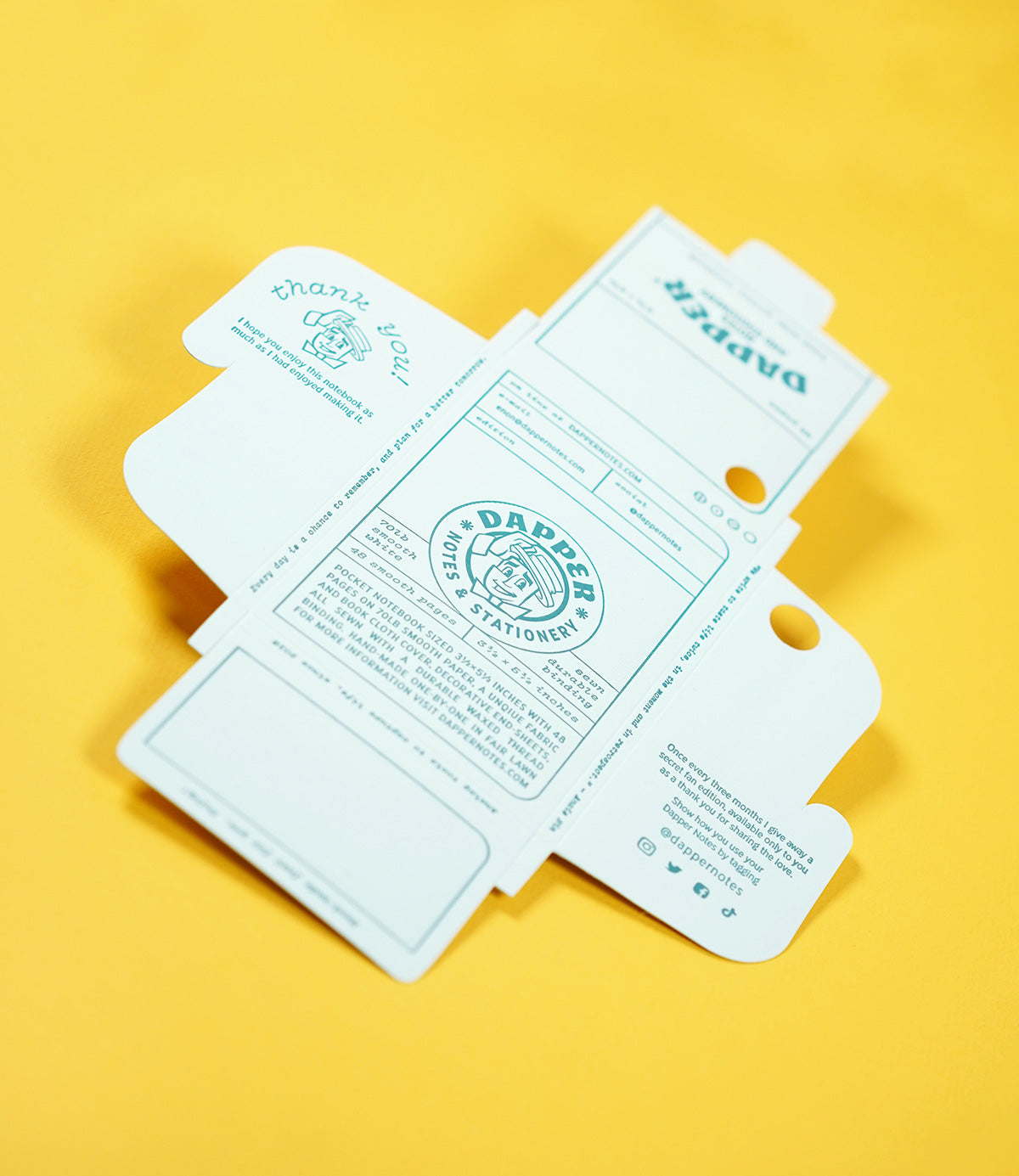
Letterpress printing is done with metal plates and is known to create deep grooves that look lovely and are very tactile. Printing a layer with no ink is known as "blind" printing, and the end result is a textured surface that looks nice and feels good too.
Fine-tuning all the details
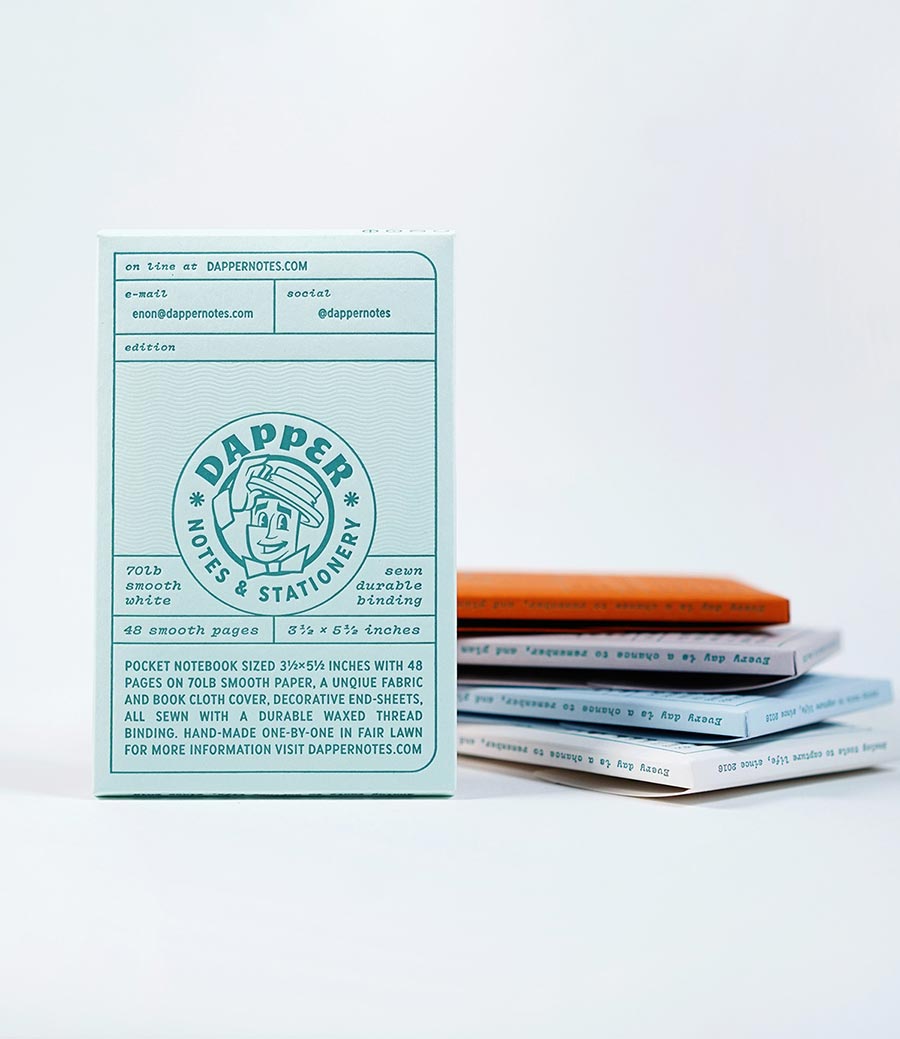
Every part of the new packaging was designed with care, and whichever way you look you'll spot a delightful detail. Speaking of detail, I failed to run a spell-check proof by my editor (read: my wife), and the whole batch was printed with a spelling error on the back. Lesson learned, me.
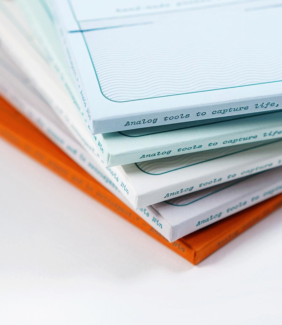
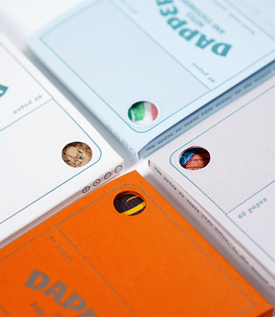
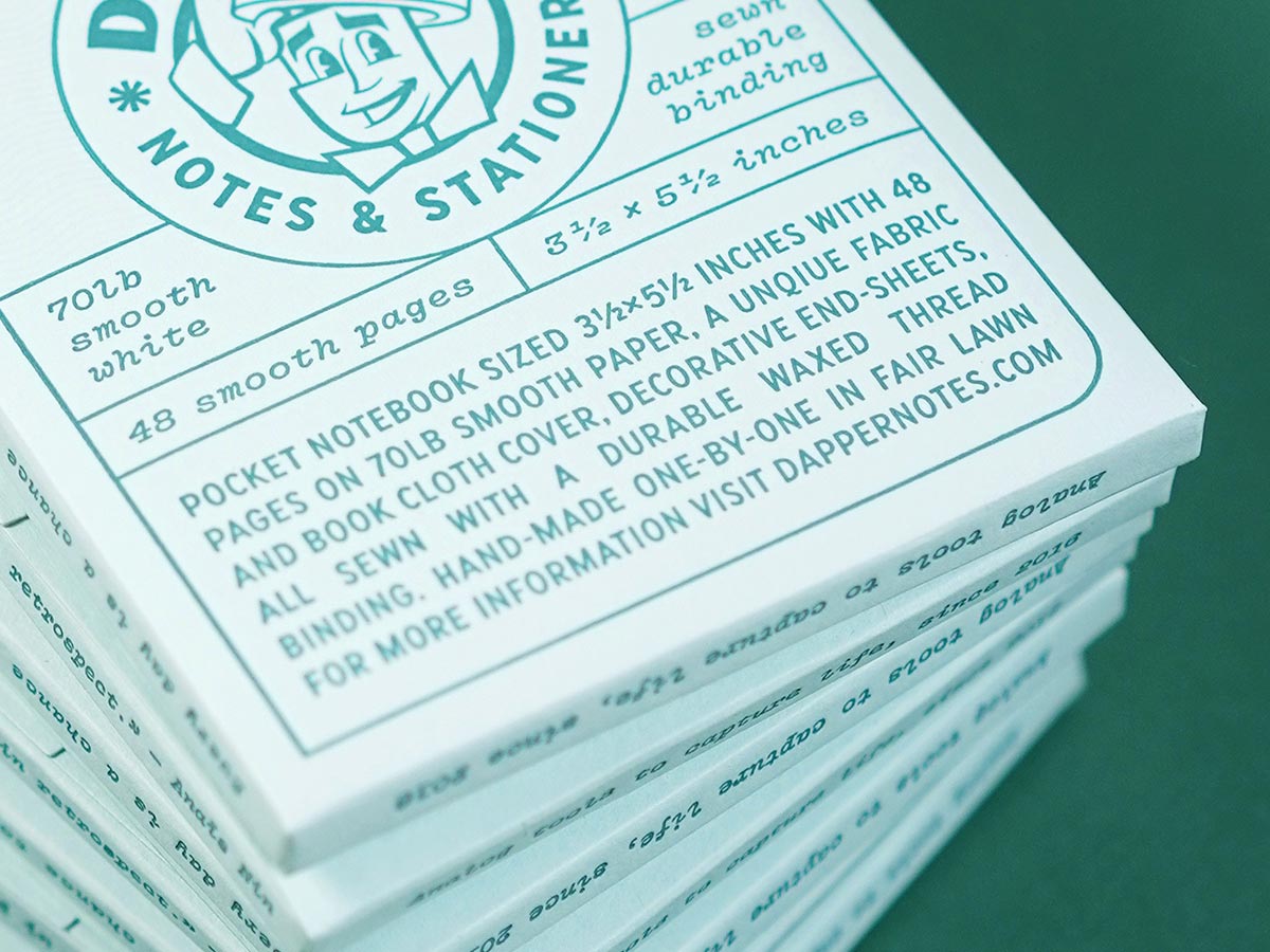
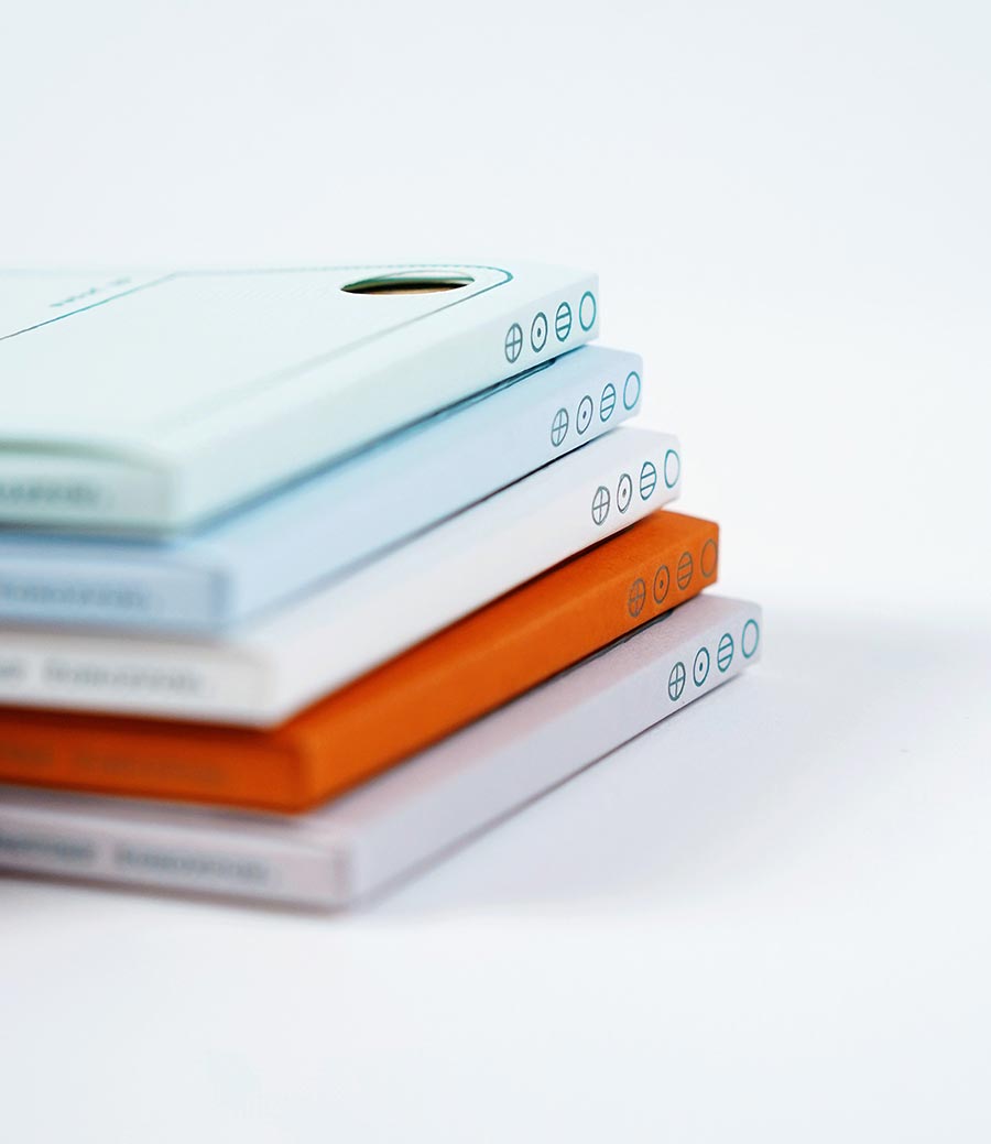
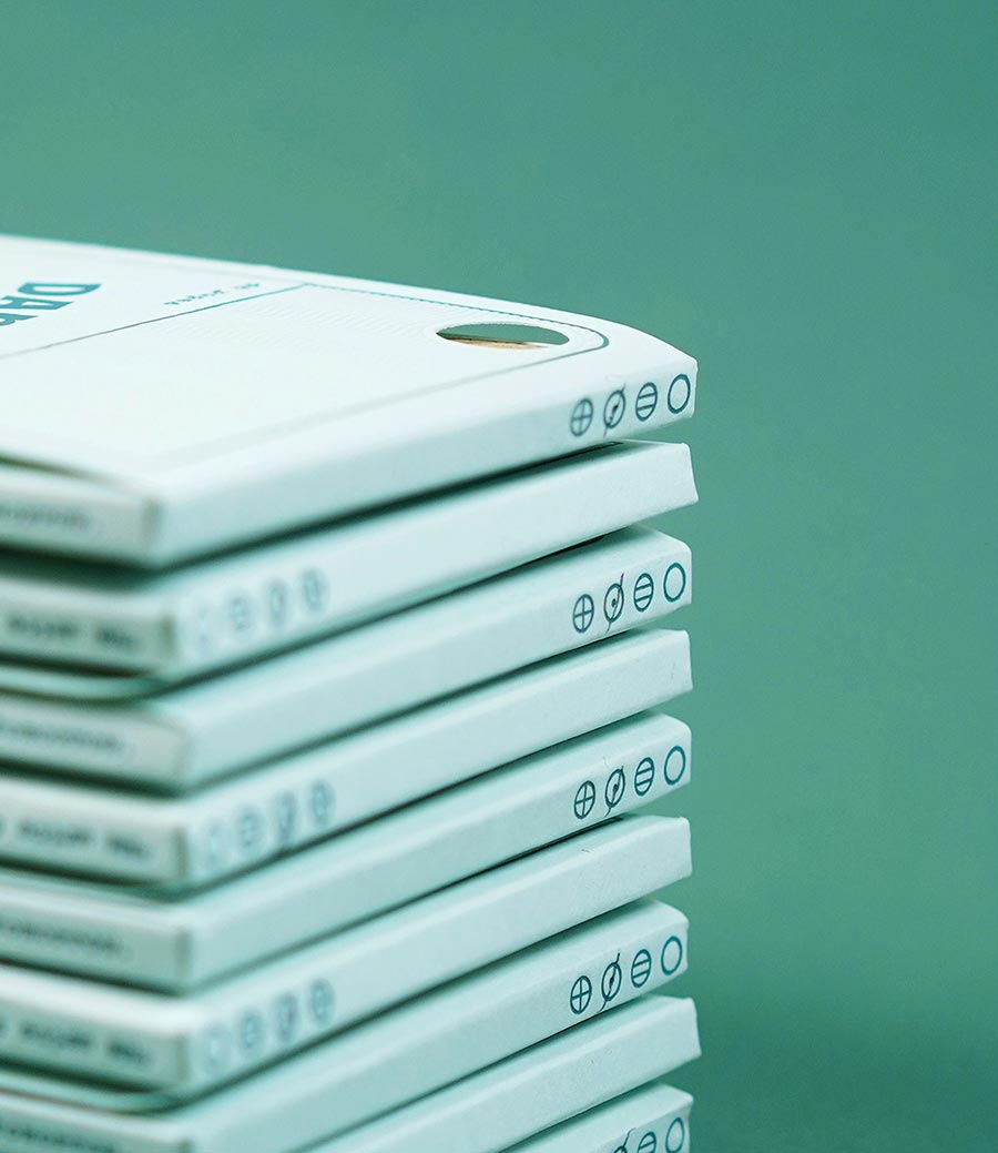
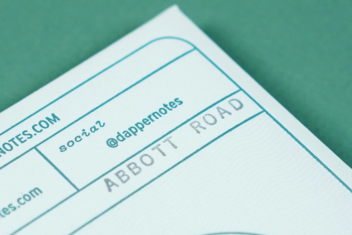
In addition to the little window on the front, there are two more spaces that are identifiers for which edition is inside. On the top there are markers where I can check off the paper style, so if an edition is available in graph and dot grid, there's a clear indicator that shows what kind of paper is inside. And on the back there's a space for me to stamp the edition's name, for yet another way to tell what's inside without having to open the packaging.
Opens up like a flower
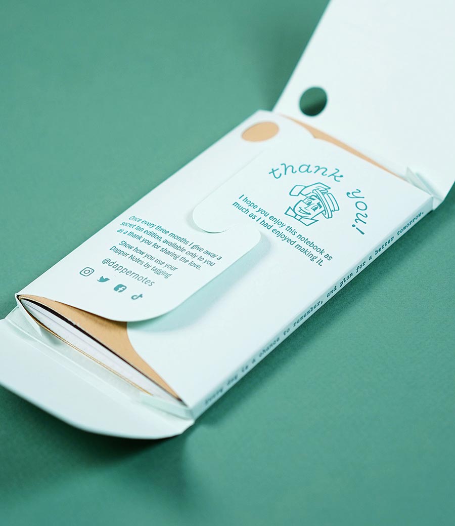
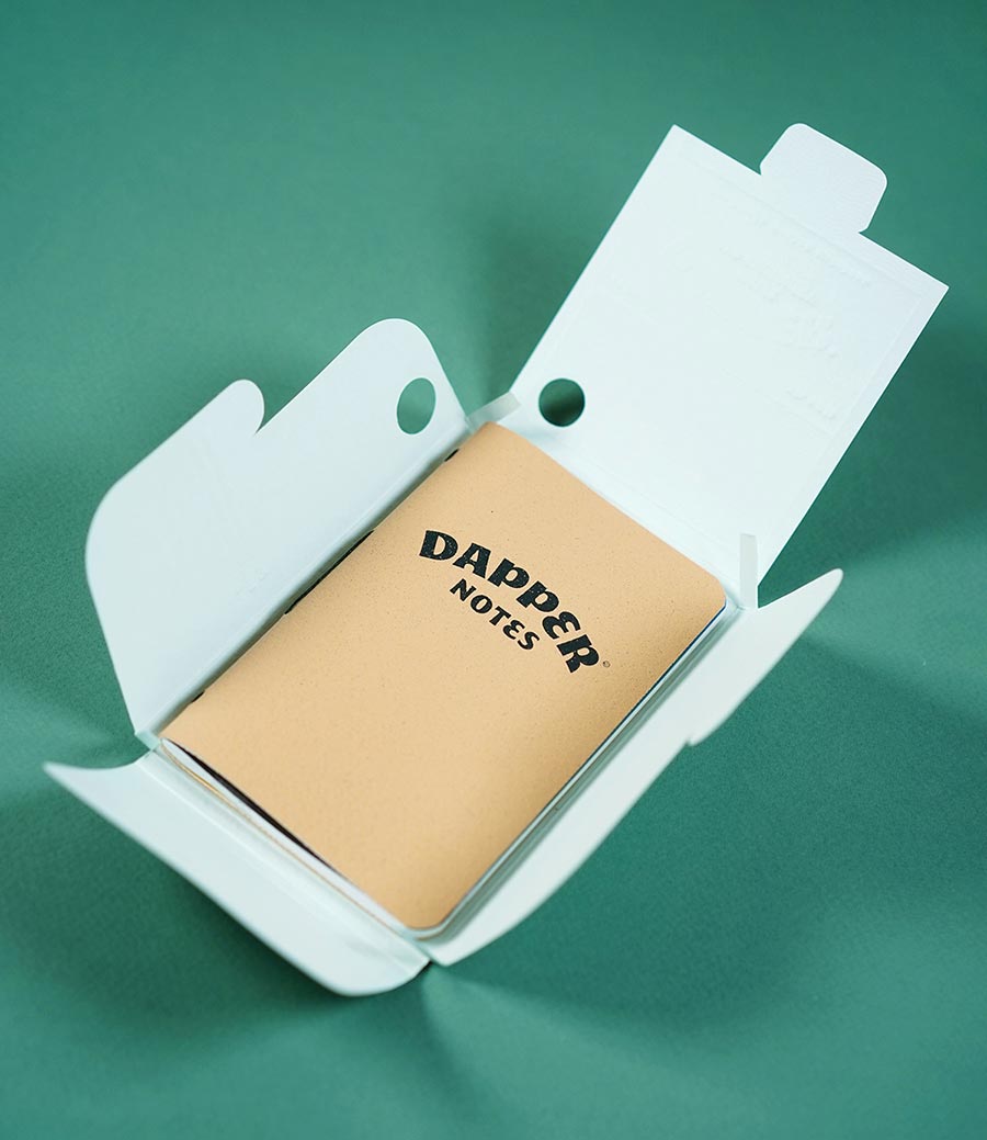
This packaging was designed to give a fun unboxing experience. After you open the first flap, you'll be presented with an interlocked lip that resembles a flower. This part also plays a crucial role in holding the notebook closed tightly.
When that closure is released you'll find your Dapper Notes notebook inside.
Capture life
Dapper Notes are made to help you capture all of life's moments. So go ahead: journal with joy, make every doodle fabulous. And keep in mind that the packaging can be used to store your notebooks once they're filled up with your everyday everythings.
