This website started out as a place for me to sell prints of my Hebrew typography work. I eventually added notebooks (originally dubbed "Hebrew Type Books," more on that here), and now have two main categories that aren't super-related to one another, aside from the fact that it's all my handiwork.
I don't plan on separating the site into two right now, especially because it's infinitely easier for me to manage everything in one place. After all, this is a one-man operation and I'd rather focus on the work than technical maintenance. But I am doing some cleanup right now, updating things like the about page to help clarify what Hebrew Type and Dapper Notes are all about.
Here's the story behind the two circular logos you've seen on this site:
E/A Ambigram
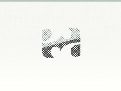
This mark was first created in May 2011, as part of my design services rebrand. My name is Enon Avital, and I realized that the lowercase letters of my initials are almost identical to one another (in the same way the numbers 6 and 9 are). This idea is better explained visually, so here's a gif I created way back then:
(see all the early "ea" explorations)
Dapper Notes
I still use this ambigram on my personal website, and now on Dapper Notes too. Here's why: When I made the first batch of notebooks for sale in January 2016, I needed something to put on the belly band for packaging. Since they were called "Hebrew Type Books", I knew I wanted to photograph them in the right-to-left position. I also knew that most - if not all - people using these notebooks would be doing so left-to-right. Turns out I was right, with some folk known to be using Dapper Notes horizontally and up-to-down.
Regardless, I had my "ea" ambigram, and as ambigrams go, flipping it upside-down is the same as right-side-up. So I added a grid onto the mark to indicate what paper you'll find inside, and voila! The Dapper Notes logo was born.
I'm especially happy that I chose to use this mark because I literally make every single Dapper Notes on my own, by hand. In a way these notebooks are an extension of me, and I love that I get to reflect that in the logo you see on every single belly band.
Hebrew Type
The story behind this mark is similar to the ambigram's. Back in February 2015 I started exploring Hebrew lettering. I didn't know anyone else who did the same, nor did I know that there was a resurgence of interest in the Hebrew letter form. After a few months of creating stuff, I started meeting other people who were also doing #hebrewtype. Thanks to Instagram, I discovered a large community of letterers, designers, and fontographers.
On January 19, 2016 (right around the time the first Dapper Notes went up for sale) I opened up the @hebrewtype Instagram community account. I wanted to create an opportunity for better discovery, so that someone like myself who's starting out doesn't have to wait long to find the Hebrew typography scene well and booming.
The new account needed an avatar, so I made a simple-but-unique version of the script letter alef א, the first letter in the Hebrew alphabet.
Since this website first started out as a place for me to sell my Hebrew type prints, I chose the same alef logo to adorn the shop, and the rest is history.